portfolio – magazine one
<< back to illustration page
–
The turnaround time for this new summer reading concept was very tight. Once I received the text from the editor, my responsibilities were to decide upon the layout and imagery for 16 magazine spreads. I researched photos to use as well as creating backgrounds and illustration.
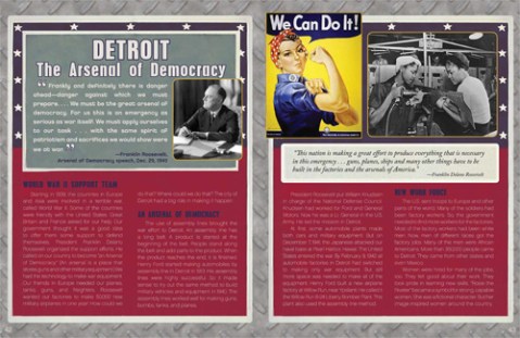
When creating the background image in PhotoShop I took care to use colors that gave a vintage 1940’s feel.
–
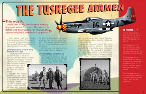
Another WW2 spread with dark colors and an “sheet metal” repeat I created in PhotoShop givng it an industrial look.
–
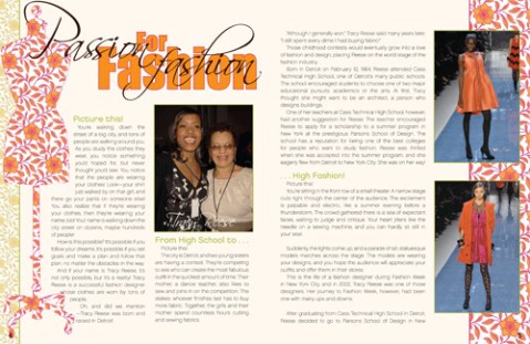
I created a pattern repeat in 2 colorways which I used to fill the mannequin shape and as background.
–
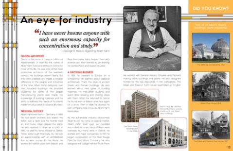
In this piece about an architect, I looked for ways to capture the feel of early 20th century styles of architecture. I created an angular decorative elements with additions of colors that I repeated throughout the spread.